RIT Mobile: Room for Improvement
by Luke Nearhood | published Oct. 24th, 2018
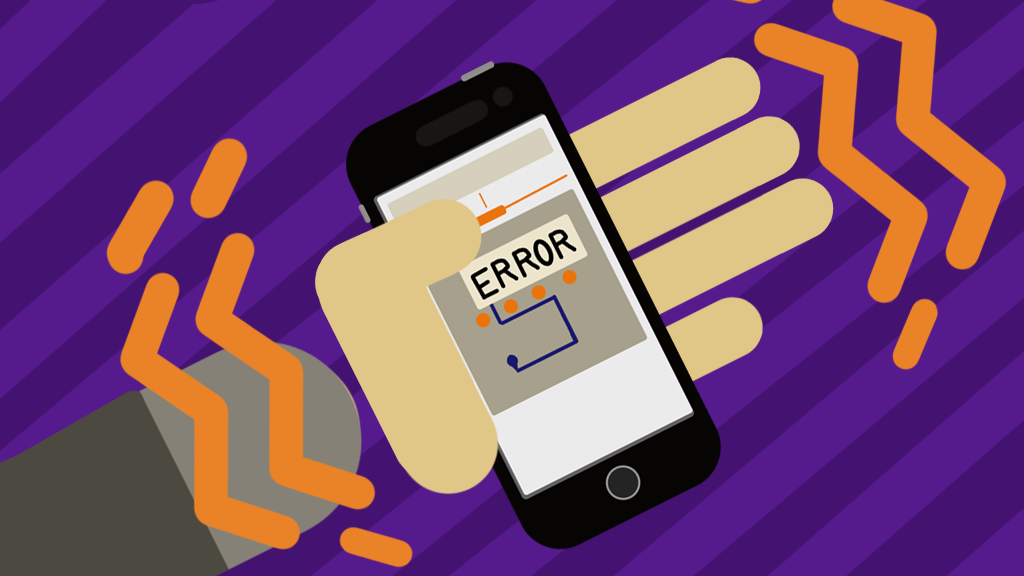
RIT Mobile is an app nearly every RIT student has to interact with at some point. Though many students grumble about it, the app is not without merit, and deserves a fair and comprehensive review.
The Pros
Among the positives is the ability to customize font sizes — an important characteristic for those with less-than-perfect-vision.
“So if you have older eyes like me, you can make bigger fonts,” said Bryan French, the web and mobile computing program coordinator at RIT. “And you can customize some other things, like the notifications, and you can add favorites.”
Sushant Kafle, a third year Ph.D student in Computing and Information Science also appreciated the customizable aspects of the app.
“I like how the app is personalized as well,” said Kafle. “That sort of personalization adds to usability.”
The app also has high contrast colors and an easily clickable button design that seeks to minimize typing. The ease with which one can click the buttons for links and sub-menus within the app is especially important, as the app functions as a collection of applets (apps within the app) and links, in which the ease with which buttons can be clicked in vital to accessibility.
“In terms of like the size of buttons, for a person with like touch issues, this has been considered very well," said Kafle.
With regards to the more behind-the-scenes side of the design, the app has decent connectivity feedback, clearly indicating when it is unable to get information from the internet. Although it can be frustrating when a page doesn't load, it is better to know the reason why.
"There's good feedback when it's trying to fetch something from the internet or update something. So it's not just locked up and wait for something, you don't know it," said French.
The Cons
However, there exists an inconsistency as to whether or not a button takes the user to a location within the app, or to an external web page. French identifies this as one of the chief issues with the app. As it creates inconsistencies in the user experience, and undermines the other positives to the design, such as consistency of appearance.
“A lot of stuff [links] go to web pages that may or may not be optimized for mobile,” said French. “So I’m leaving the app to go there."
The issue of some applets opening web pages also poses issues in terms of accessibility, especially for those who require the use of a screen reader to interface with the app, Kafle explained.
Another problem with the app is its attempt to act as a catch-all hub for RIT information. Thus the app sacrifices excelling at any one functionality.
“Generally, with mobile apps, you want to concentrate on your core audience, or your core functionality,” said French.
This lack of focus also leads to other issues within the app — including multiple, redundant ways to get to settings. While not the biggest deal on its own, it is a symptom of the apps lack of focus.
“There’s like three different ways to get places,” said French. “So they should probably pick one and be consistent.”
These redundant menus also create issues for devices with smaller screens, French went on to explain.
“When the menu goes to the right hand side, it like, scrunches together, and you can’t really see things,” he said.
There also exists a useless search function that arbitrarily refuses to appear for users on the guest persona.
“Wasn’t sure why there wasn’t a search for guest users, but there was for RIT users,” said French. “I didn’t find it particularly helpful anyways.”
The use of the term persona within the app also poses an issue, as it introduces jargon the user may not be familiar with, and adds additional clutter.
“They do use ... jargon, like persona ... a lot of people might not know what a persona is,” said French. “Basically you shouldn’t use jargon in the app.”
The app's lack of focus and the issues that stem from it are primarily due to the app not being designed in-house at RIT, but by a third party, Modo Labs.
“It’s developed by a third party, and it looks like they’ve sold it to a lot of universities, and so it’s a template,” said French. “Again, it’s trying to be everything to everybody.”
Despite the many criticisms thus far leveled at the app, it is not a lost cause. The existing design issues can potentially be resolved. One option would be to create separate apps for each applet, or groups of related applets. An alternative that wouldn’t necessarily require rebuilding the app from the ground up would be to allow the user to set it so only favorites show, or have the user opt into what applets they see on the main menu.
“It’d be better if they had an RIT mobile bus app, and dining app, or maybe one that just combines those, and maybe have some of the academic related stuff in a separate app,” said French. “Or ... here’s my favorites, and then if I go into settings later I can then add from all these other choices.”
There are certainly ways to make at least marginal improvements to the app without a complete rewrite. However, in order to be something people actually enjoy using, and not merely tolerate, it must be something that comes from within RIT, not just a generic template with the appropriate colors and links filled in.