RIT to Launch Site Redesign
by Kasey Mathews | published Mar. 3rd, 2019
For the first time since RIT launched its websites in the late 90s, a comprehensive redesign is underway. Set for a “soft launch” in early March, the redesign will unify the RIT brand across most of its major websites, providing a consistent message and aesthetic.
As a soft launch, not every website will see a redesign by March — notable examples include Finance and Administration, Saunders College of Business and Student Affairs and Academic Affairs. However, the homepage, myRIT page, four college pages and more will reveal a new, consistent look with more website redesigns being launched later as they are completed.
John Trierweiler, chief marketing officer for RIT, explained that the new website is aimed at better fulfilling three areas. These are: providing a safe and secure environment, improving the web experience and providing a spotlight on the RIT community.

The homepage
Starting with the general layout change, with the new redesign the RIT homepage will feature a revamped navigation bar at the top with the aim of directing users to areas based upon their relation to RIT — such as prospective students, current students, faculty, staff, alumni and partners.
The top left of the page will hold calls to action, such as “inquire,” “visit,” “apply” and “give.” This refers to questions and contacts, arranging visits to RIT, applying to the various degree programs and provision of donations, respectively. The top right on the other hand, across all of the main RIT webpages, will display three permanent buttons: “news,” “directory” and “myRIT,” which will be explained more in depth later in the article.
With the old site, organization on focus points became the main issue. Trierweiler touches upon how the new site will improve this challenge.
“We have ... over 1800 websites, believe it or not, which is pretty staggering,” Trierweiler said. “[But] it’s just not doing justice and not providing the appropriate spotlight on who we are and what we’re doing here.”
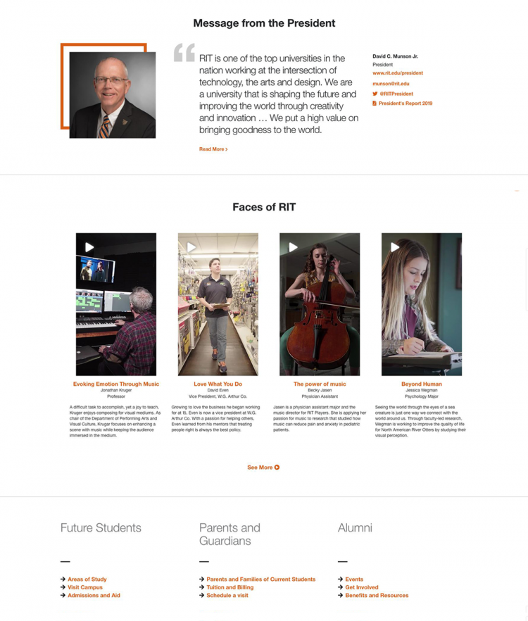
To rectify this, the homepage will also feature members of the RIT community — student, faculty, staff and alumni — in a silent 30-second video. The video, run on a muted loop, will showcase various parts of RIT, from athletics to student clubs. Additionally, each college website will also feature a college-specific video tailored to the disciplines found within it.
Below the video will be an infographic showcasing major RIT statistics, such as placement rates, as well as highlights of the facets of RIT that have helped to boost its reputation, such as its unique co-op program. The homepage will also feature a message from RIT President David Munson.
This will immediately be followed by a “Faces of RIT” section, with more videos. These videos, as opposed to the one appearing on loop at the top, will be vertical 30-second videos showcasing specific students, faculty, staff and alumni. They will shine a spotlight on their successes and the interdisciplinary potential that comes with attending the university. One such video showcases a premed student who talks about her love for music — a great example of the ability students have to pursue their different, often disparate interests.
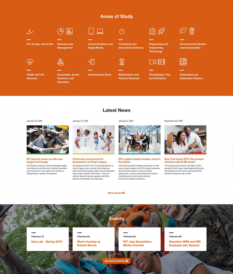
The next section is a directory of majors, this time divided into disciplines rather than colleges. As a feature dedicated to making programs easier for prospective students to find, this will eliminate the prerequisite need for individuals to have an understanding of the nine different colleges of campus and the schools, departments and majors of which they’re comprised. Instead, prospective students can quickly find what they’re looking for.
This is followed by a news section, highlighting several of the most significant news stories from across campus. More news can be found in the button at the top, as previously mentioned.
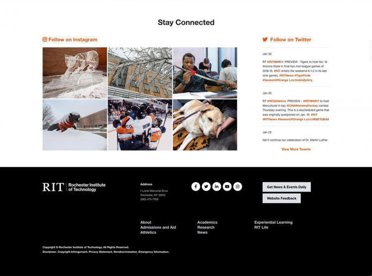
The homepage ends with a live feed of RIT’s social media and a boilerplate collection of links to direct users to various other pages within RIT’s online environment.

New Features
Going more into depth with the three permanent buttons at the top of the redesigned cite, ("news", "directory", "myRIT"), they will specifically direct users to helpful, encompassing pages.
The news page has been revamped, with a new tagging feature allowing news to be spread across colleges and departments based on subject matter. No longer does each news story need to be posted individually to each page; rather, the author can tag the post and it will automatically populate on all relevant pages, increasing readership and subject visibility.
These news stories will populate across every college page, showcasing relevant highlights to that college including research, alumni spotlights, student projects and more. The RIT homepage will then populate with the biggest, most significant stories from across all disciplines.
The directory aims to be an all-encompassing list of faculty and staff. As a common complaint received by students, it has been difficult to find faculty and staff members. In tandem with compiling a complete collection of the 4000+ faculty and staff members at RIT, there is also an ongoing effort to provide a professional photo for each of these individuals. While approximately 3200 have already been implemented, placeholders are currently in use for the remaining.
Each faculty member will be provided a profile page, as well, listing their expertise, a short bio, their office location, office hours, publications and courses taught. This will ensure students have access to all relevant information in one place.
For the faculty’s benefit, this will also ensure individual faculty members are easier to find by outside peers. A major part of higher education is the peer review of research publications. By ensuring faculty at RIT are easier to find and their expertise easier to identify, we can expect a higher number of them to be contacted for opportunities such as this.
Finally, myRIT will receive a facelift. Currently, myRIT is a collection of links administrators deemed useful for the community. However, usage of myRIT is low, in part due to the overcrowding of the page with many links relevant to only select sections of the RIT community.
With the upcoming redesign of myRIT, the page will serve as a password-protected dashboard for RIT users based upon their specificity. By logging in, the page will recognize which demographics a user falls into, whether they be student, faculty, staff or alumni. The website will also recognize which department the user is in and more. Through these readings, the links populating the page will be specific to the common needs of other users with similar demographics.
For example, a student in the College of Art and Design will see typical links for students, such as Parking and Transportation Services and Dining Services. However, it will also show links specific to the resources of that college, such as advising and events.
Director of University Web Services Raman Bhalla did recognize that students are also likely to have a dual major, a minor, an immersion or cross-disciplinary interests. As such, there will also be a feature to find the various resources of other colleges, as well, ensuring equal access to all students, without needing an inherent understanding of the individual college pages.

Other Features
Beyond these major changes, many less critical additions are also coming.
An “RIT Life” page, which will showcase what a day is like on campus through the eyes of various clubs, organizations, events, athletics, programs and more. These will also feature many more “Faces of RIT” videos.
A “Visit” page will display all of the necessary information for visitors to RIT. This will include a map showing the location of Rochester relative to other cities. A list of nearby cities such as Montreal, Toronto, New York, Boston and Buffalo will be present on this page, as well, with driving distances included. Also, it will show hotels divided into categories based upon distance from campus, helping people find lodging during their visit.
Finally, an updated and comprehensive program catalog will show a custom image representative of the specified major, an updated list of graduation requirements, admissions requirements and links to learn more and to apply.
Being the first time that RIT has undergone such a dramatic redesign of their web presence — and especially in light of various recent negative publicity unrelated to the website — this project looks to be a great benefit to the RIT community. It is inclusive of students, faculty, staff and alumni, in an effort to make resources easier to obtain and life on campus more readily celebrated.
Edited March. 4, 2019 at 12:27 p.m.: The article originally stated that eight college pages will be updated with the redesign during the initial launch, however the correct number is four.


