The Design Philosophy of Selling Nostalgia
by Sam Finston | published Apr. 18th, 2017
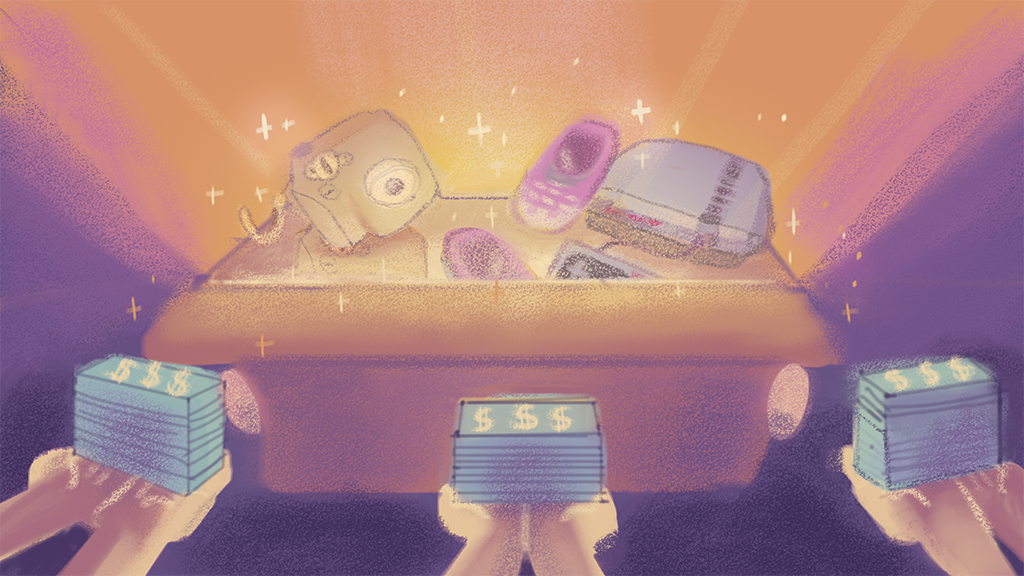
Looking around the tech landscape of the past few years, one might find that going "retro" is not as outlandish a strategy as it might seem. Purposely old-school devices like Fujifilm’s increasingly popular Instax Camera and Nintendo’s NES Classic (which famously sold out shortly after its release in the fall of 2016) have indicated that there is success to be had in trying something new with something old.
Back in February, Nokia made headlines as well by bringing a 16-year-old cellphone back from the dead. They announced the new Nokia 3310, an update of the classic 2001 monochrome phone of the same name.
Unlike its namesake, the revived 3310 sports a sleek new design reminiscent of a space age television. In a market filled with black rectangles, Nokia’s new phone certainly sticks out, but so does the its lack of features. A physical keypad and a month-long battery life come at the cost of some of the accoutrements that define the modern cellphone. While it is an improvement over the original model, its relatively slow internet, 2 megapixel camera and 2G connectivity may disappoint consumers accustomed to a standard iPhone or Android device.
However, what Nokia's marketing is emphasizing is in fact the retro nature of the phone. They even make a point of mentioning that its battery life is not only impressive, but similar to the original model’s. Additionally, one of their main selling points is that the phone comes packed with an updated version of its predecessor’s popular game, Snake II. Just by naming the 3310 exactly the same as the original, Nokia is clearly trying to tap into some latent nostalgia among potential customers.
Channeling the Familiar
Bruce Leonard and Kim Sherman,
“There’s equity in what’s familiar,” said Leonard. This can be seen in products that haven’t changed very much visually over the years. Cameras for instance, which have seen dramatic changes in technology over the years, have maintained many of the same design motifs for generations.
“But the gestalt of the product is still very much something that was developed many years ago.”
“There’s some ergonomic improvements here and there,” explained Leonard
“Consumers really believe that the quality of the product is based on its appearance.”
“Consumers really believe that the quality of the product is based on its appearance,” explained Leonard. “If a camera doesn’t look like a camera, then it’s not gonna take good pictures.” According to Sherman this is one of the reasons why aesthetics are so important when marketing such products.
“It’s not just about making it look pretty, it’s about making it look appropriate,” added Sherman. A product has to look like it can do what a potential user wants it to do. The product’s aesthetic should ultimately convey to the user exactly what it does and how it does it.
“There’s a certain function to the aesthetic of a product, and there’s a certain aesthetic to the function of a product.”
“There’s a certain function to the aesthetic of a product, and there’s a certain aesthetic to the function of a product,” said Sherman. “When it’s really well designed, it becomes tough to define the two.”
As for familiar designs, there’s a reason why not every new product that’s released looks straight out of science fiction. Something that looks too futuristic may appeal to a certain crowd looking for something new and exciting, but many will reject a design for being too unfamiliar and uncomfortable. People are typically more willing to invest in the familiar.
One then has to wonder about the "retro" design elements for a device like the 3310, such as a physical keypad and a month-long battery. To a certain type of user, these features might still seem natural and innate choices for a phone.
Sherman mentioned that he teaches his students something called the Maya Principle, which is all about designing products aesthetically to be the most advanced, but still acceptable. As technology progresses more and more, designers are constantly tasked with softening the new tech so that it is approachable and understandable, even as new innovations tap untested waters.
Innovation or Recycling?
With the number of nods to the past featured in the 3310's advertising, one might be suspicious of a device so overtly leaning on its history. After all, it is hardly uncommon for companies to cash in on nostalgia. As a result, such attempts of revamping old ideas are often not seen as creative, but lazy.
“Maybe a little bit lazy,” said Sherman. “But it’s also smart.” Any amount of familiarity in a design can do wonders for its appeal. “It’s not a good thing or a bad thing. It’s just one of the tools a designer has to work with.”
“There’s strength in what’s familiar.”
“There’s strength in what’s familiar,” added Leonard. “There’s strength in what people like and trust. Appearance drives a lot of trust. All of that coming together to make a purchase.”
Perhaps a number of customers will have an affinity for the familiarity of the 3310. Both Leonard and Sherman pointed to how some people might yearn to be able to text without having to looking at the digital keypad and others might not be able to invest the time to learn how to use every new feature. A lot of people who use smartphones don’t even utilize (or know how to use) all of their device’s features. Even more people perhaps can't afford or might not want to spend the money on, a new iPhone or Android. For all these possible scenarios, a simplified and familiar phone like the new 3310 could be a perfect match.


