


You may have noticed some changes going on around campus. Some changes are little, while others can be quite startling. But rest assured: everything that’s happening is completely natural. Like a caterpillar emerging from its cocoon, RIT’s new brand will spread its wings and soar — soar with a new branding identity system that perfectly unifies RIT's disparate visual elements.
Circle Circle, Dot Dot
Removing the dots separating the letters in RIT’s logo was an attempt to refresh its look. In addition, the logo had to be updated for digital use — "in digital advertising and other small applications, the dots tend to disappear" according to the Brand Portal's FAQ. To Chris Lyons, a professor of graphic design and brand consultant, this change suggests a switch away from our university's full name to its acronym. When it comes to marketing, there’s a lot in a name.
“I think a name can throw people off. I mean, Rochester Institute of Technology doesn’t sound like a place a designer or an artist is going to go to. It’s not going to resonate,” said Lyons.
For Lyons, the shift towards the acronym and away from the name is part of a larger move towards creativity.
“It’s less about the visual, it’s more about a positioning change than a branding change,” he said.
The removal of the dots, however, comes at a cost: the negative space between the letters in RIT's logo becomes uneven. While removing the dots was an uncontroversial and necessary change, those dots also fixed the spacing problem inherent in the Baskerville typeface — the official typeface of the RIT logo — according to Carol Filip, a professor of graphic design.
“It was a spacing issue that naturally happens between the I and the T,” said Filip. “What they’ve done to it in taking out the dots, it feels uncomfortably close in some areas and far in others.”
Most gaps between letters can be filled through the process of kerning. But to resolve this particular spacing problem, RIT would have had to change its primary typeface. Such a change would be expensive, as typeface licensing for a large university could easily cost tens of thousands of dollars — not to mention the cost of application over such a large college campus. But in an attempt to change it up without actually changing it up too much, the administration replaced one visual problem — the presence of the dots — with a new one.
This challenge is echoed in the changes to typography — specifically in the switch from Helvetica to Neue Haas Grotesk for a secondary typeface. Neue Haas Grotesk is heavily inspired by Helvetica to the point of being nearly identical, but lacks Helvetica’s name recognition. This makes things more complicated for non-designers who are working with the new branding’s style guide, according to Filip.
"For a non-designer, it’s a lot to remember and a lot to figure out," she said.
Filip envisioned a situation in which a non-designer, confused by the similarity of the two typefaces, would use the incorrect older typeface.
"I think it’s more complex than it needed to be," she said.
The rebrand chooses to make incremental changes over bolder ones, which was Professor and Graphic Design Department Chair Nancy Bernado’s principal issue with the rebrand.
“I would like to see the logo of the university represented in perhaps an even more innovative way,” said Bernardo. “I was on a focus group for it and was a minority in my thinking about the logo and what I liked. It seems a little safe to me and I think we had a great opportunity to really shift our look.”
If the core of the rebrand is highlighting RIT’s unique innovative spirit, the rebrand itself should follow suit, according to Bernardo.
“MIT has [a] really interesting logo that seems to play off of the conceptual notion of innovation,” said Bernardo. Rebranded by rockstar design firm Pentagram, the MIT Media Lab’s rebrand was lauded as conceptually bold and technologically advanced throughout the design community.
“I think with this new version, we don’t really grab at the essence of who we are or show that we are cutting edge or innovative,” Bernardo said.
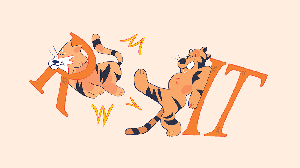
Why Is The Tiger Smiling?
Of course, logos and Swiss typography weren't what had people talking. Perhaps the most forward facing update of the rebrand was the update of our Ritchie, specifically its non-athletic variation that was redrawn to have a smile. Almost immediately after the redesign was released, the smirking tiger Spirit Mark became the subject of ridicule on social media; comparisons to Tony the Tiger and furries — people who recreationally dress as and identify with animals — were made.
Professor of Graphic Design Patti Lachance, who is in favor of all other aspects of the rebranding, is not on board with Ritchie’s new grinning makeover.
“I understand the rationale, but it’s a tiger. They were born to be fierce,” Lachance said.
“I understand the rationale, but it’s a tiger. They were born to be fierce.”
Unlike typefaces or colors, Ritchie’s face is something that students, faculty and alumni have an emotional connection with — that’s the idea of having a mascot. Dramatic changes to that particular brand element will always be more visible and more talked about. It’s good to get people talking, but ideally, the talk should be more positive.
There’s no such thing as a perfect rebrand. This is especially true when it involves such a diverse community, all with their own needs. It truly is a challenge to create an identity system that’s flexible, but consistent. The designers must toe the line between understanding the needs of the audience and dictating standards to create a cohesive visual identity. Even when it is great, it still takes people a while to warm up to it.
Some criticize the rebrand for changing either too much or not enough, while others praise the move as a long awaited step in the right direction. But will the new rebrand grow to represent the school? Or will the school grow to represent the rebrand? That's a question that can only become clear with time.


