Dozens of new comics get released weekly by a huge amount of different publishers and comic houses. It’s pretty impossible to follow them all, but every week or so I’ll try my best to fill y’all in on some of my favorite new releases, from big guys like Marvel or DC to not so big guys like Image or Boom!
Howard The Duck #1 from Marvel

Of all the solo hero comics for Marvel to announce, “Howard the Duck” seemed like one of the most unlikely possible choices of them all. A ’70s character with an awkward cult-hit live action film in the ’80s, “Howard the Duck” had been largely irrelevant for a long time. After an entertaining cameo in “Guardians of the Galaxy,” it seemed like something was sparked deep in Marvel’s comic headquarters in New York, and soon afterward they announced that they would be gracing this goose with a new solo comic series of his own.
For those unfamiliar with the character, he is essentially a duck/private investigator that talks like a sarcastic 1970’s New Yorker. What was once a period-accurate character trait back in his original comics is now elevated into even more hilarity when his personality clashes with the modern sensibilities of the rest of the characters in this comic. He calls She-Hulk “doll” and gets chastised for it, but his inflated ego keeps him from learning to change the habit. Rather than being about a world-ending cataclysm or a battle of the ages, this comic series seems to just be a look into the slightly mediocre life of a tired talking duck in a city full of ridiculous heroes and villains.
The art and writing are some of the best of any currently-running Marvel comic. The art is detailed and colorful, and helps make everything pop and show the right kind of hilarious faces and reactions from the characters. Small details help make the book even more entertaining, like when a character goes undercover by wearing a uniform that says “NORMAL ROOF REPAIRS” across the back. The writing, meanwhile, perfectly characterizes everyone in the book, and every joke seems to land as strongly as possible.
“Howard the Duck” is a strong start for a promising new title, and with all of the convoluted comic plots that Marvel is putting out, it’s nice to have something so grounded and relatable to get into. Well, aside from the sarcastic talking duck.
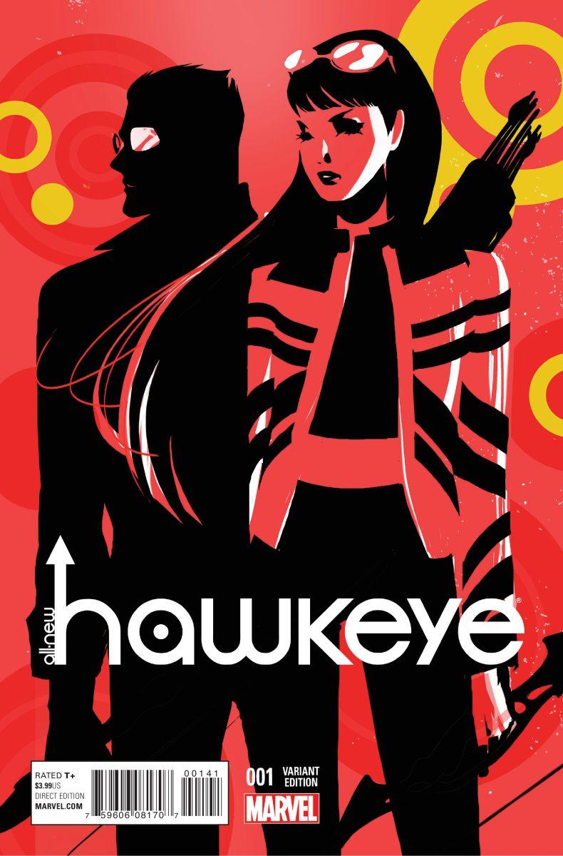
All-New Hawkeye #1 from Marvel

The latest run of “Hawkeye” by Fraction and Aja was revolutionary. It was one of the most successful new Marvel comics in a long time, and that success bred future creator-driven titles based on solo heroes rather than big teams — titles with incredible personality, unique art and some of the strongest storytelling in any comic. It seems impossible to follow up Fraction’s run on “Hawkeye,” but Lemire and Perez manage to put together a promising title that, despite lacking the same punch as Fraction’s “Hawkeye,” is sure to impress readers.
The comic uses art in an incredible way, morphing the style in relation to the story beats. It’s an interesting storytelling mechanism that turned an art style I would usually be put off by into something incredible and unique. The comic splits itself among a painterly art style and an style that lifts heavily from Aja’s work. Thankfully, noticeable differences in things like facial expressions and character framing help elevate it from just feeling like a ripoff of the Aja style.
The writing in this is as strong as you’d expect from a new “Hawkeye” comic, though the circumstances of the story hinder it a bit. A huge part of the appeal in the new “Hawkeye” comics is how it shows the way Hawkeye balances his everyday life as Clint Barton with his begrudging work as Hawkeye, and the punchy comedic writing from Fraction helped make eight pages of Hawkeye laying on his couch doing nothing be some of the best pages of the year. In “All-New Hawkeye #1,” we’re thrust right into the middle of flashback drama and present-day superhero action, and while the same personality is in the writing, the fact that we aren’t given a moment to relax or find something to relate to in the issue makes it a bit harder to be gripped by what’s happening.
Lemire and Perez have an incredibly tough act to follow, and while I’m sad to see Fraction and Aja no longer headlining a “Hawkeye” comic, it’s good to see that the new team recognizes what it is about these comics that readers enjoy. Hopefully they can stay on that course.
The Surface #1 from Image Comics

Image Comics is a rising star in the comic industry. They have an appealing policy of giving creators 100 percent ownership and control over their properties, and this leads to a lot of creative freedom and unique projects being released under the Image banner. “The Surface” is one of those unique projects. This comic is set in a future controlled by technology and consumerism. The comic has incredible potential in the way it manipulates the comic medium to tell a unique story; unfortunately, the story itself is so vague and incredibly dense that it’s hard to get excited about said potential.
The book does a lot of interesting stuff that flips the usual way of formatting comics on its head. There are sections in the middle of the comic that are text-only prefaces and Q&As from the author that tie into the actual fiction of the story, making it hard to distinguish how much is truth and how much is expanding the plot of the comic. There are also editor’s notes at certain points in the comic early on that point out potential clues in dialogue. What the clues are for is never made clear, but the idea of these editor’s notes is eventually dropped pretty early into the comic, making it seem like more of an afterthought.
Despite these interesting hooks, the pure writing of the comic is bloated and uninformative. Each page seems like it was filled with as many words as they could put in for the simple sake of having a lot of words. A lot of it, especially the narration, is just redundancy and empty phrases that do nothing to flesh out the world or the characters. Dialogue is done in such a back-and-forth manner that it ends up giving us almost no information about the characters or their motivations, other than vague mentions of holograms and a broken reality.
If there is any saving grace to this comic, it’s the art. The art is distinct, and the colors and shading help make it clear just what kind of world they live in.
This comic is an interesting experiment, but by the end of it I was struggling to read most of the words on the page. With a different story or a different writer, this idea of a comic that morphs the usual format could be something worth reading. But as it stands, I don’t see myself continuing to follow this series.
Descender #1 by Image Comics

“Descender” is a sci-fi comic about giant robots and alien bounty hunters, with enough of a unique story hook and engaging art style to help set it apart from the dozens of other stories about giant robots and alien bounty hunters.
In a far-off planet that houses the United Nations-style government coalition of nine planets, life is going as normally as it would on an alien planet until, out of nowhere, nine planet-sized robots appear in front of each of these planets.
And they attack.
In the aftermath of billions of deaths and widespread hatred for robots and artificial intelligence, a child stranded on a Moonbase wakes up 10 years later to find his entire colony dead, except for his tiny robot-dog companion. Now, the one scientist in the galaxy with the proper robotics knowledge has to work with a struggling team of government investigators to find out exactly what happened on that day 10 years ago.
The art in “Descender” is beautiful and immediately eye-catching. I rarely find a painterly or watercolor art style that has the same sort of distinct linework and detail as a normally-drawn comic, but “Descender” somehow manages to use a watercolor art style that makes everything pop, from character’s faces to expansive landscapes.
The writing, too, is immediately engaging. While the initial setup is a bit stereotypical, the dialogue and writing style help keep it engaging and fresh. It also helps that almost every dialogue box has a different color and font, which helps flesh out each character even more.
“Descender” is off to a strong start, and I’m definitely excited to see where it goes from here.

